Infographic
Lipstick Shade Names Analysis
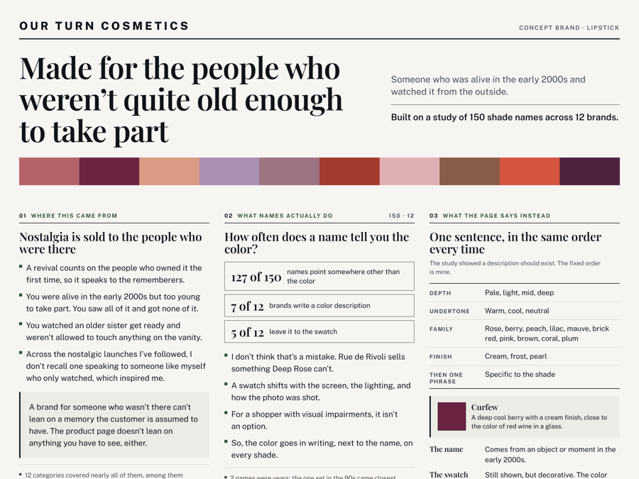
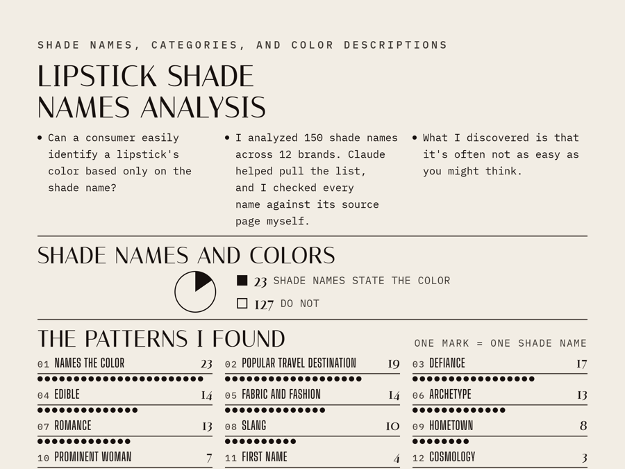
An analysis of 150 lipstick shade names, and the accessibility case for writing the color somewhere on the page.
Read the Lipstick Shade Names Analysis pageI'm interested in why things work the way they do, and in explaining it clearly enough that someone else can act on it.
Open to: Trust and safety, content moderation, community management, and content strategy roles, wherever careful judgment and a habit of asking why matter most.
Information & brand design
An analysis of 150 lipstick shade names, and the accessibility case for writing the color somewhere on the page.
Read the Lipstick Shade Names Analysis pageA concept lipstick brand for people who were too young for the early-2000s trends, with accessible product pages that write out every shade's color.
Read the Our Turn Cosmetics pageUX design
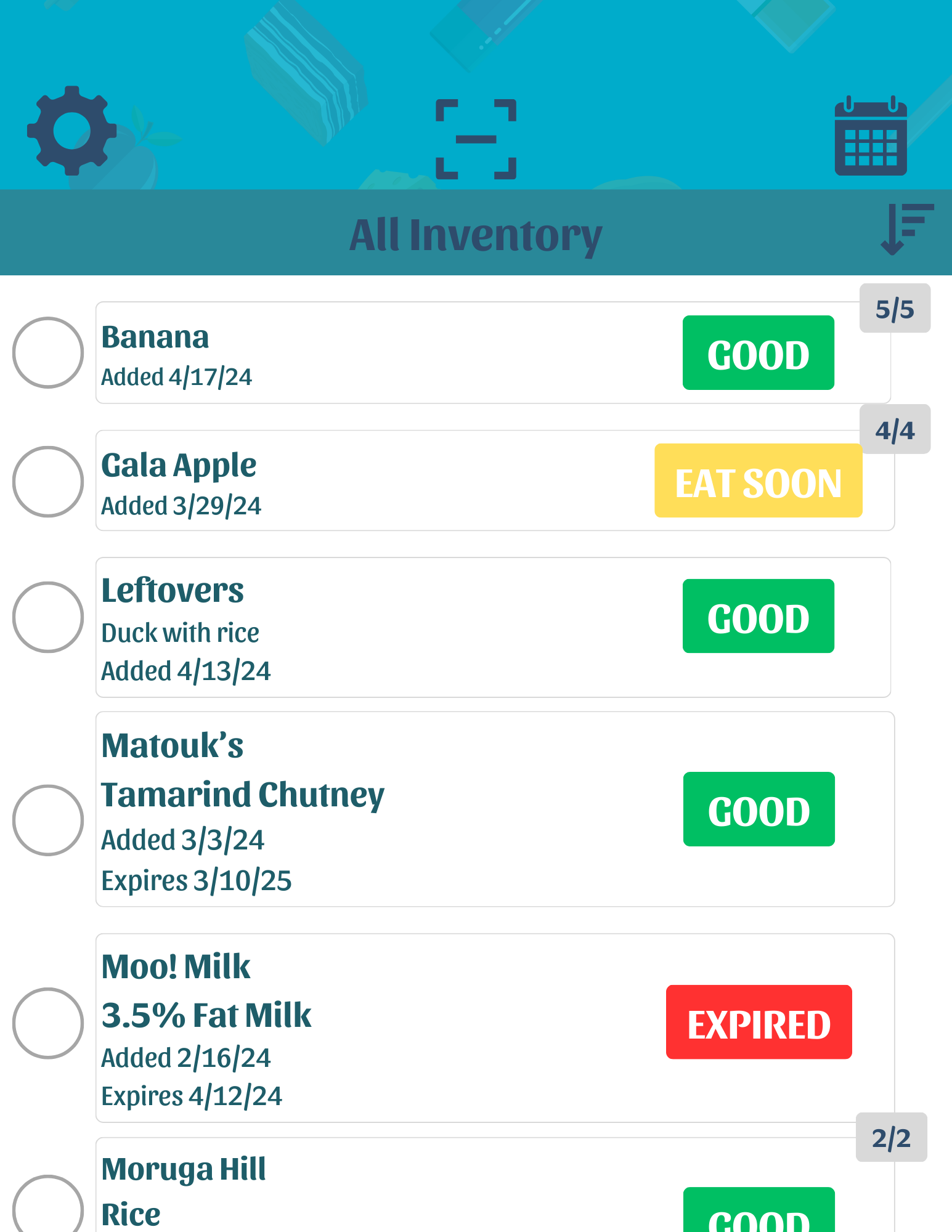
A universal food-waste app for tracking freshness, expiration, and inventory, designed with households in Trinidad and Tobago closely in mind.
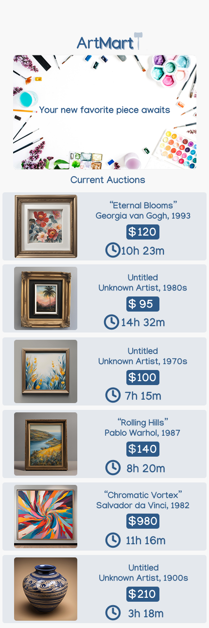
Read the KitchIntel case studyAn art-auction app built through the Google UX Design Certificate, from research to high-fidelity prototype.
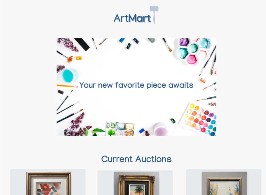
Read the Art Mart App case studyA responsive companion site to the Art Mart app, designed for a cohesive experience across devices.
Read the Art Mart Website case studyBranding & logo design
A logo built around an ascending arrow: speed and rising revenue, woven into the wordmark.
Read the Swift Marketing case studyA phoenix mark replacing the "o," pairing complementary blue and orange to signal trust and energy.
Read the Phoenix Solutions case studyA hand holding currency forms a capital "L": lending and the brand name in a single mark.
Read the Lend Easy case study2-D & visual design
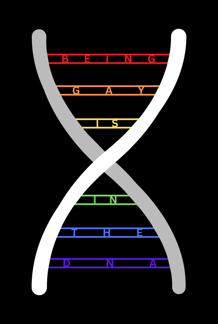
"Being Gay Is In The DNA" set into a double helix, with pride-flag colors arguing identity is innate.
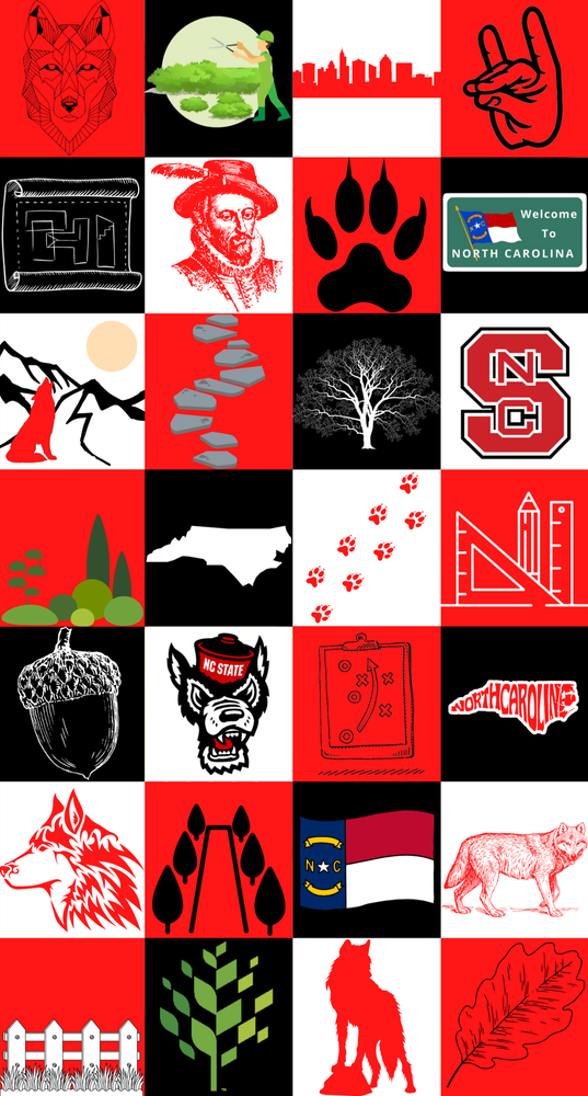
Read the Global Issue Poster case studyA mural for Kamphoefner Hall in the style of Steve Wolf, woven with NC State and Raleigh symbolism.
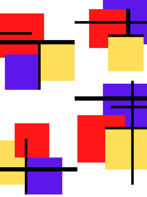
Read the Building Mural case studyA De Stijl-inspired study balancing straight black lines against red, blue, and yellow planes.
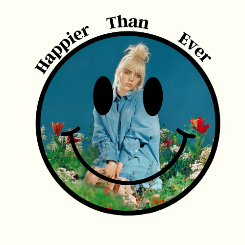
Read the Black Lines and Color Planes case studyA redesign of Billie Eilish's Happier Than Ever album cover, using a smiley face and flowers to signal happiness and growth.
Read the Album Cover Redesign case studyI'm Lindsay Boyle, a design researcher by training based in the Raleigh-Durham-Chapel Hill area of North Carolina. I graduated summa cum laude from NC State University with a Bachelor of Arts in Design Studies, where I studied design history, material culture, and design thinking. I've since completed the Google UX Design Professional Certificate.
In one class, I took apart a children's coat and a broken pair of my own sandals, looking at materials, construction, and how long each was built to last. My work spans UX, branding, and visual design, and it usually starts with research, working out what a project needs to solve and who it's for.
Outside of design, I've spent over four years moderating and administering gaming Discord communities, including one with 31,000+ members. Writing for a thousand people who reply instantly has taught me more than anything else about how people read what you write, not what you meant.