Our Turn Cosmetics
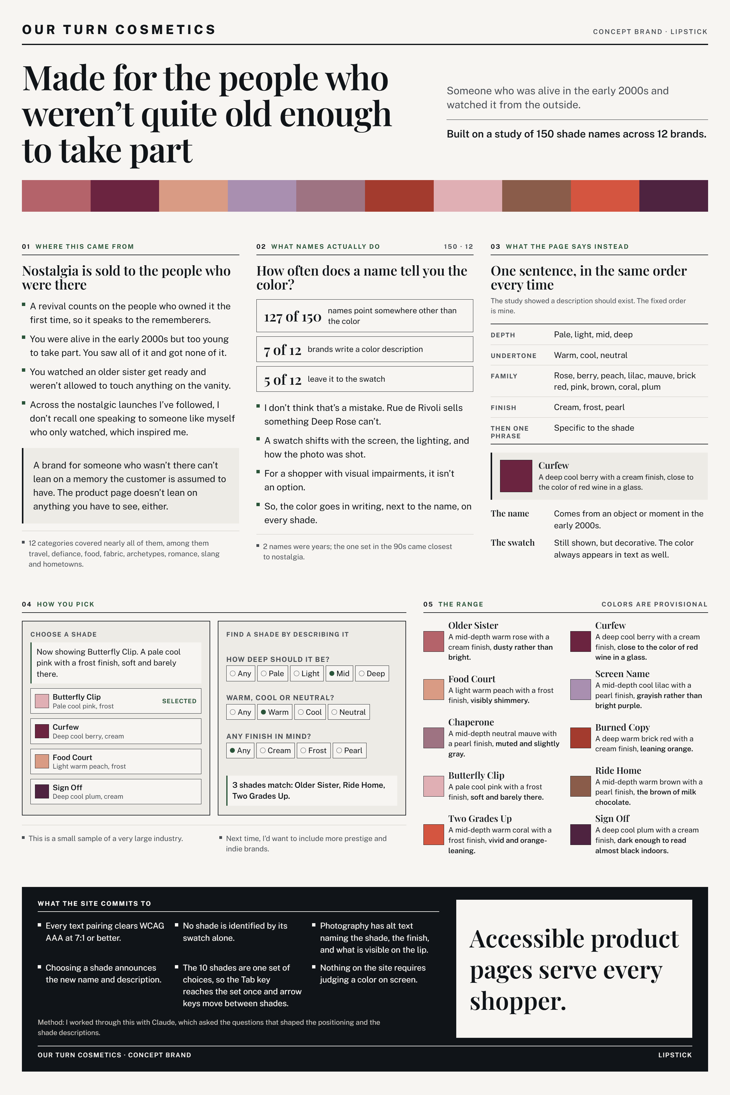
A concept lipstick brand for people who were alive in the early 2000s but too young to take part, with product pages that write out every shade's color so no one has to rely on the swatch.
Situation
Nostalgia sells to the people who were there. A revival counts on you taking part the first time, so it speaks to the rememberers. I was alive in the early 2000s but too young to take part. Across the nostalgic launches I've followed, I don't remember one speaking to someone who only watched. A brand for people who weren't there can't lean on a memory they are assumed to have, so I decided its product pages would not lean on anything you have to see, either.
Task
Design a concept lipstick brand for that audience, and give it a product page that never asks a shopper to rely on a memory or on seeing the color: the color written out, in words, on every shade.
Action
I built Our Turn around people who watched the early 2000s from the outside. It has a color palette, a 10-shade range, and names drawn from objects and moments of that time: Older Sister, Butterfly Clip, Curfew, Screen Name, Sign Off, and others. It grew out of my Lipstick Shade Names Analysis, which found that most shade names point somewhere other than the color, and that pages often leave the color to the swatch.
So, the product page writes the color down. Every shade gets one sentence in a fixed order, depth, then undertone, then family, then finish, then a phrase specific to the shade, so Curfew reads "a deep cool berry with a cream finish, close to the color of red wine in a glass." The swatch stays, but it is decorative; the color always appears in text, too. A shopper can browse the range or find a shade by describing it, how deep, warm or cool, and which finish. All of it is built to accessibility standards: every text pairing clears WCAG AAA contrast, photos have alt text naming the shade and finish, and nothing on the site asks you to judge a color on screen.
Result
Our Turn closes two gaps at once. A shopper who wasn't there in the early 2000s doesn't need a memory to belong, and a shopper who can't rely on the swatch, whether from a visual impairment, screen settings, or lighting, can still tell what color they are buying, because it is written down. It is the design answer to the Shade Names Analysis: the study found the color often isn't in words, so this brand always puts it there.
It doesn't assume you were there in the early 2000s, and it doesn't assume you can see the swatch. Back to all work →