Album Cover Redesign
A redesign of Billie Eilish's Happier Than Ever album cover, using a smiley face and flowers to signal happiness and growth.

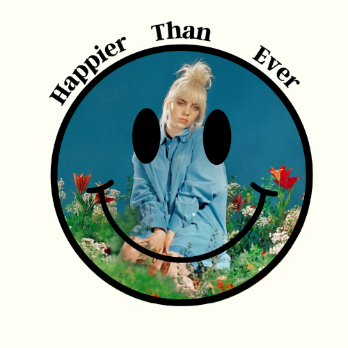
Situation
For a project in ADN 111, Introduction to Two-Dimensional Design, I was asked to choose an existing album cover and redesign it using 2-D design principles. One rule shaped the whole assignment: any text from the original cover had to stay on the redesign.
Task
Redesign the cover of Billie Eilish's Happier Than Ever, applying my knowledge of 2-D design principles while keeping the original cover's text intact.
Action
I built the redesign around clear symbolism and a deliberate link back to the source:
- Color: I borrowed the background color from the original cover's palette, so the redesign stays visually tied to the album.
- Concept: I made a smiley face the focal image, the universal symbol of happiness, connecting the design directly to the album's title.
- Imagery: I chose a photo of Billie Eilish that keeps the vintage aesthetic of the original, and surrounded her with flowers as a symbol of growth.
- Text: per the brief, I kept the original cover's text in the new layout.
Result
The final cover reworks Happier Than Ever with simple symbols, happiness in the smiley face, growth in the flowers, while staying tied to the original through its text, vintage feel, and borrowed color.
A smiley face and flowers got the idea across on sight, without leaning on the text. Back to all work →