Phoenix Solutions
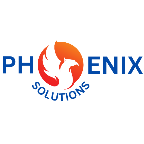
A phoenix replacing the "o," in a complementary blue and orange palette.
Situation
Phoenix Solutions was one of the company names Left Jab Media gave me to interpret into a logo. I set out to put the idea of a phoenix at the center of the logo.
Task
Design a cohesive logo that captures the idea of a phoenix.
Action
I built a circular graphic of a phoenix to replace the letter O in Phoenix, with the word Solutions curved beneath it for cohesion. I chose blue and orange as the primary colors for their complementary contrast, which makes the mark feel balanced and helps the phoenix stand out as the focal point.
Result
The final logo brings the phoenix together with the company name, using a complementary palette and clean type so the whole thing feels cohesive.
The complementary blue and orange gave the small mark its contrast and balance on their own. Back to all work →